Mobile Design
The case for mobile
According to Pew (2017), 95% of Americans own a cellphone
and 77% own smartphones.
Chaffey's data indicate that users browse information on
mobile but use desktop to refine and dive deeper. He advocates designing for both mobile and
desktop to support this "Multichannel Majority" (2017).
Context: Car-Buying App
Integrated user context in a car-buying app
- APPROACH: Conducted an exploratory survey and an online open card sort to inform the information architecture
- DELIVERABLES: Proposal including Sitemap, Wireframes, Personas, and User Stories
- TOOLS: Axure, ConceptCodify, Google, InDesign, Photoshop
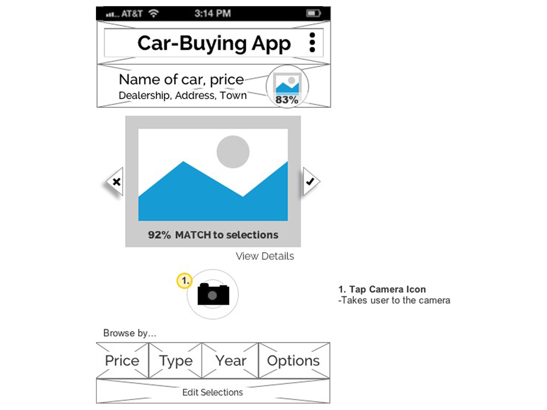
I proposed a context-aware design for an app where users can customize a collection of cars.
The user creates a database of vehicle images that are ranked by percent match to named preferences.
It uses context again to display no-haggle pricing at local dealerships.

Ask me about Integrating TRUECar.
Native App: City of Chicago
Adapted website for iOS/Android native app
- APPROACH: Emphasized consistent UI patterns, text menus, and minimizing steps for the user
- DELIVERABLES: Annotated wireframes for iOS and Android
- TOOLS: InDesign, MockPlus, Photoshop
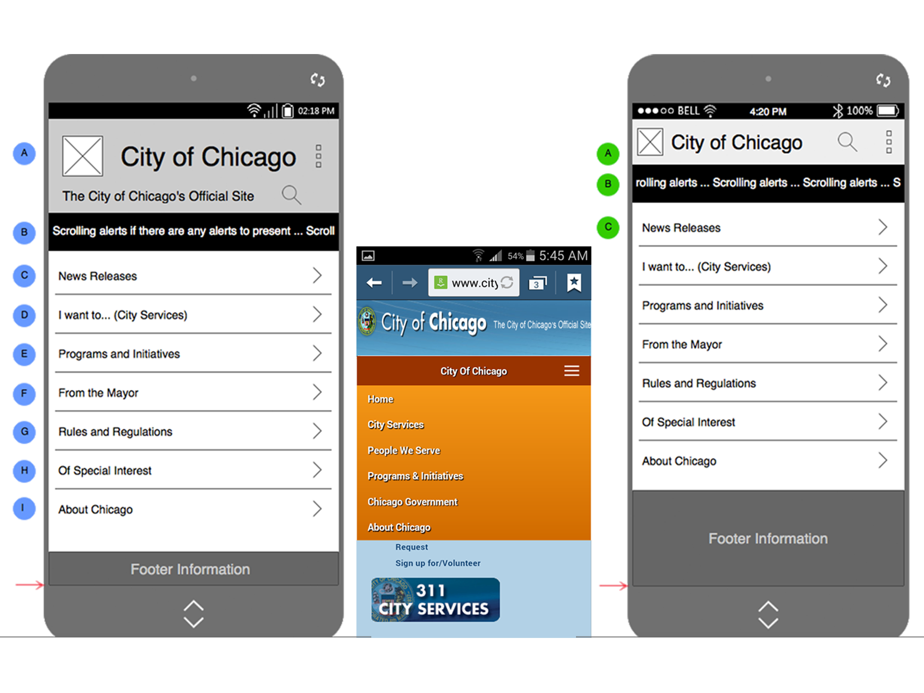
Our professor asked us to reimagine the City of Chicago website as a native app.
I iterated two task paths in both Android and iOS. I focused on creating a consistent
user experience between the two platforms.
Ask me about MockPlus.
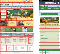
Static Web to Mobile: Insignis
Designed responsive mobile views for a static commercial website
- APPROACH: Reduced user's cognitive load by distilling information and emphasizing hierarchical navigation
- DELIVERABLES: Grid Overlay, Annotated Sketches
- TOOLS: Pencil/Paper Sketches, Photoshop
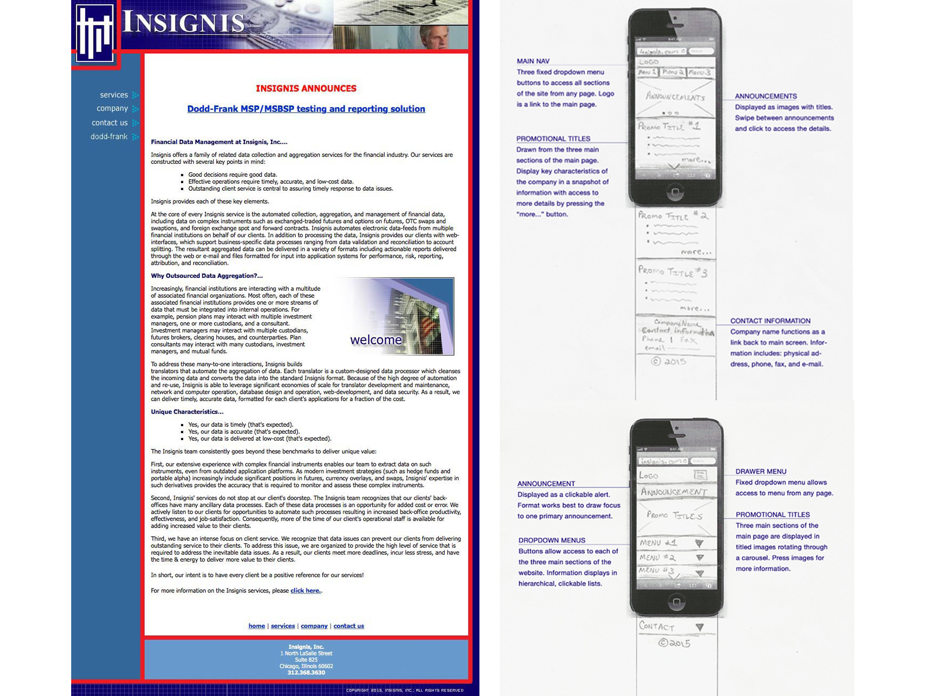
As a financial data aggregator, Insignis' site is dense with specialized information.
First, I focused on making the information easy for a mobile user to browse. The sketches can adapt
to responsive design.
Ask me about the sketches.
References
Chaffey, D. (2017, March 1). Statistics on consumer mobile usage and adoption to inform your mobile marketing strategy mobile site design and app development.
Smart Insights, Mobile Marketing Statistics compilation.
Retrieved from http://www.smartinsights.com/mobile-marketing/mobile-marketing-analytics/mobile-marketing-statistics/
Pew Research Center (2017, January 12). Mobile Fact Sheet. PewResearchCenter, Internet, Science & Tech.
Retrieved from http://www.pewinternet.org/fact-sheet/mobile/